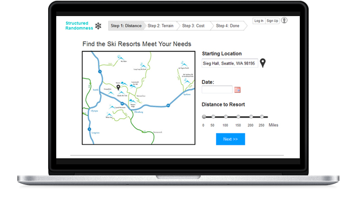

Ski Resort Search Site

Our goal is to help skiers and snowboarders quickly and easily make informed decisions where to go skiing or snowboarding. Our website compiles and presents the
most pertinent information about all the resorts in the Northwest region. This includes detailed information about the terrain, weather conditions, cost, and proximity of each resort to the user’s location.
Skiing and snowboarding are fun activities and we believe that the process of booking a trip toa ski resort should be as well. Our website will make the search process for ski resorts intuitive
and informative so that users focus less on logistical obstacles and more on enjoying their trip.
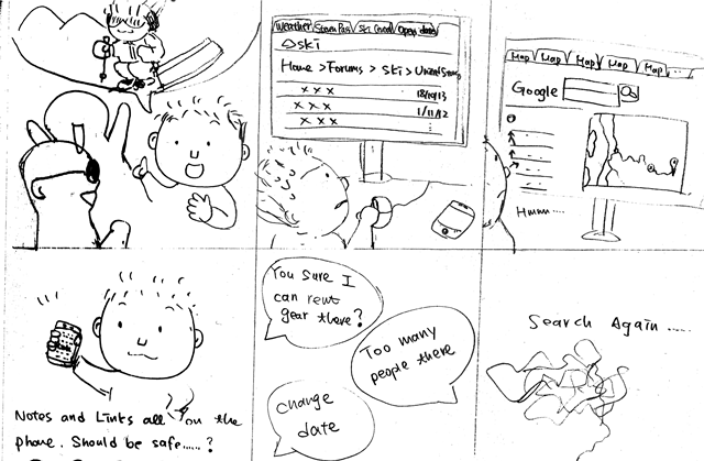
How might we enable a skier/snowboarder to find a resort in the Pacific Northwest that best matches their criteria for terrain, proximity to their home, and conditions?
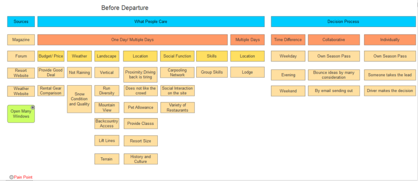
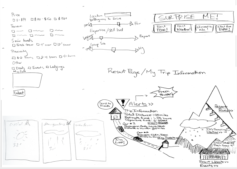
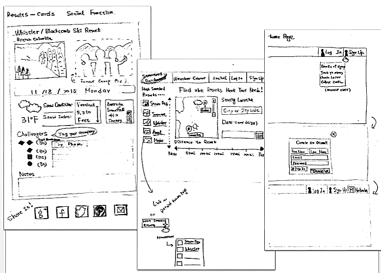
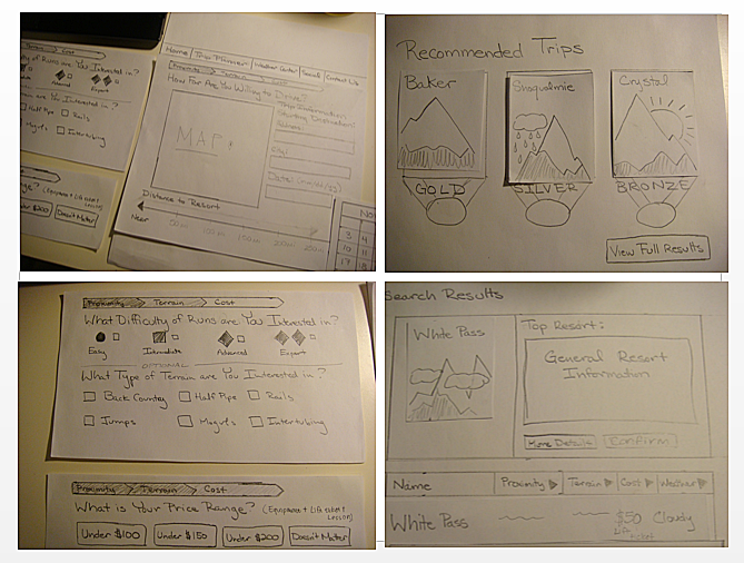
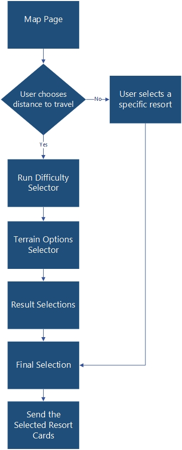
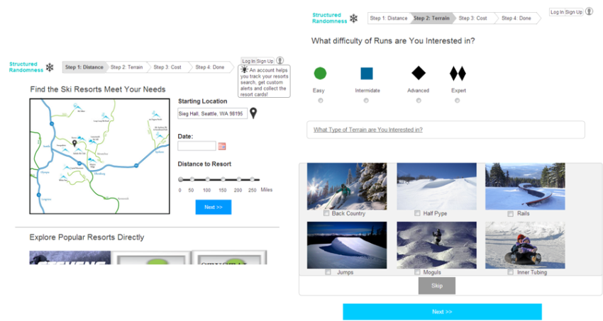
| Why only show resorts in a certain distance range? | In our research we found that the travel distance to a ski resort is one of the top two things people consider when going to a ski resort. We discovered people are only willing to drive a certain distance and are only interested in seeing resorts within that range. |
| Why allow a user to go to a resort card directly and skip the resort choosing process? | We found that in our earlier prototypes some users wanted to only know information about a specific resort. These tended to be people that had a season pass to a ski resort or had a favorite resort. The resort selection process was of little interested to these people. |
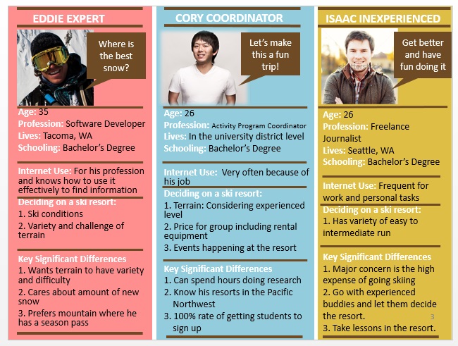
| Why allow the user to skip the terrain section? | We found that mostly only new skiers and snowboarders or people that don’t know the local ski resorts very well care about this information. These users need help in determining a resort that meets their terrain needs. Users that already know the local ski resorts tend to skip this step since they already know the terrain of most resorts in the area. |
| Why show different terrain options for the different terrain difficulties? | In earlier prototypes we found users didn’t want to see all terrain options all the time since some did not match their skill level. For example someone interested in intermediate runs, will probably not be interested in going to the backcountry. This a terrain area that is typically at the advanced or expert difficulty level. |
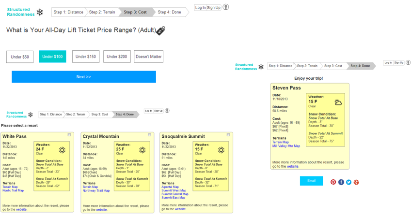
| Why the search result is formatted the way it is? | One of the thing we learned from our lo-fi paper prototype is that the users don’t trust us to have us select what is best for them. Having a gold (aka 1st place), silver (aka 2nd place), and bronze (aka 3rd place) medal put the search in a ranks that users are not comfortable with. Some user already know what s/he wants to go, while other wants to do more research. So, providing the 4 main pieces of information (distance, cost, terrain, and weather) at equal value without ranking allows the user to do their own search and comparison. |
| Why display the final selection? | It allows user to review what was selected before emailing it. User can shared among themselves or through social media. |
| Why have the information be sent via email? | Since the site does not have a login account setup to save the data, the user can sent the information to him/herself or to anybody they would like to have it. |
| Do you need an email confirmation? | Yes, so that user will know what is happening; whether an email has been sent or not. |