Lead UX/UI Designer
Contributions include creating user insights & ideation, content strategy, visual design, designing end-to-end staying experience running on large touch displays and conduct usability testing.
Small and Nimble Team
Collaborated with Project Manager and Creative Developer. Services alignment with Microfost IT Development team.
Oct 2014 to Mar 2015
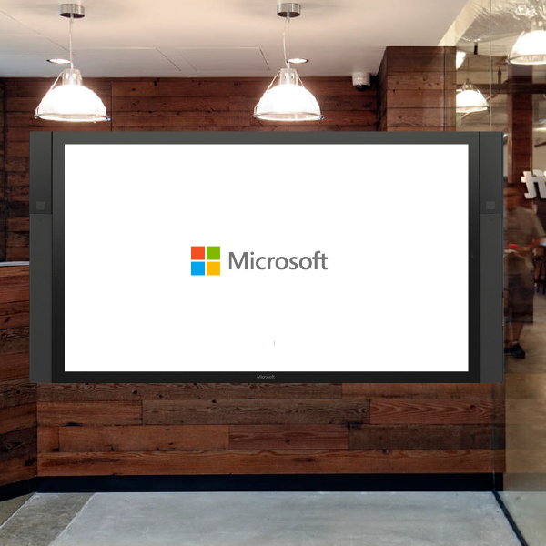
A Microsoft Real Estate & Facilities group pilot phase project to revamp the HQ campus experience for visitors.
Summary
A lobby provides visitors with a critical first impression of organizations. When strategically designed and executed, lobby displays in a lobby can inform and direct as well as reinforce company's brand personality. Our design challenge is to help Microsoft Real Estate & Facilities group to revamp the whole lobby stay experience by informing, providing self-service, educating and entertaining. Various visitors who are waiting approximately 8 minutes in the lobby until their hosts receive them will be immersed in Microsoft’s company information through multi-touch and interactive service design.
Background and Opportunity
 According to the research from Microsoft Real Estate & Facilities group, an estimated 400,000 people visit Microsoft offices in the Seattle area every year and visitors usually spend approximately 8 minutes in the lobby until their hosts receive them. We see this as an opportunity not merely about bringing Microsoft lobbies up-to-date and unifying them across more than 100 buildings in the region, but how we might create a world-class stay experience to entertain and educate visitors about Microsoft’s story through interactive media.
Research
Microsoft Real Estate & Facilities group’s phase one research objective was to gain baseline data and expert insights around Microsoft current-state lobby processes and behaviors by service behavior analysis and shadowing and global reception interviews. The research was situated in the context of experience design and emotion-oriented design for hospitality. My team used the research to learn more about how to evoke positive emotions and to enhance the lobby stay experiences.Use cases
 Based on the research data, we have defined our lobby visitors as job candidates, international business visitors, visitors from other cities, employees and family members or children. Different personas have individual needs and use cases. An interesting finding is that some visitors consider the lobby stay experience itself as an exploration in the sense that they could experience something new or learn about certain cultural or knowledge elements of Microsoft. This is especially prevalent among those research participants who had time for leisure activities during their business trips. Also, pleasant emotions such as surprise and delight were evoked by the content such as Microsoft art collections and local attractions in the Seattle area. After prioritizing the user needs and the goals from stakeholders, we first create the following information architecture and present the 9 individual interactive experiences:


Navigation Pattern - Consistent experience across all pages

Final Design
How might we design a welcome screen that engages users, harks back to the microsoft brand, and moves beyond the traditional static interface?
The Home Page is the looped footage that invites users to engage with the screen. The looped footage includes 15 seconds each of diverse people of different genders, age, and races.
The Campus Map offers a bird’s eye view of Microsoft campus in Redmond. Users can scroll the map and tap on the yellow hotspots to reveal additional information and panorama photos of various landmarks.

How might we design a different approach with gamification that would make visitors interested in learning about Microsoft campus?
Users take virtual driving tours to learn about the Microsoft campus. As the ride progresses, time-based hotspots synced with the video appear on the left and right sides. If clicked, they reveal more information on featured campus landmarks.
How might we design an experience that would make visitors interested in learning about 15 campus fun facts at the same time?
Users play with campus fun facts questions and answers with visually rich effects.
How might we effectively provide local information for visitors?
Users see local attractions on a dynamic map based on their specific areas of interest, from museums and biking trails to wineries and brewpubs. The menus on the right help users to jump into a specific category and browse the recommended local places. Users can even receive personalized directions to those attractions through text messaging.
The Products page features a see-through effect between a storytelling video and an animation on the back. Users learn about Microsoft products by discovery in an interactive experience.

How might we design a quick news browsing experience with the constraint of pulling small size images from Microsoft's internal news site?
The News section accommodates 8 news articles displayed on the screen in three vertical sections: Title & Date, Description and Image. Users browse through the news by scrolling vertically, which triggers a series of background stock photos that are sliced and realigned continuously.
The Art Collection page features a scrollable carousel of artifacts synced with a floor map of a given building highlighting their specific location. User can also solve the art collections puzzle.


The History page features a scrollable timeline of key MS events, as well as vintage images and videos related to specific time periods.

Usability Testing
A total of 25 participants aged 25 to 45 performed simple tasks browsing each category including news, art, places, products and history pages and gave my team essential feedback. I was in charge of conducting three rounds of usability testing by interviewing and taking notes while users were asked to perform and complete typical tasks such as "Can user easily associate the art pieces’ locations with the map?" or "What is user's understanding about the virtual tour start page?"
Challenge and Learning