UX/UI Designer, collaborated with Creative Developer Paolo Tosolini.
Summary
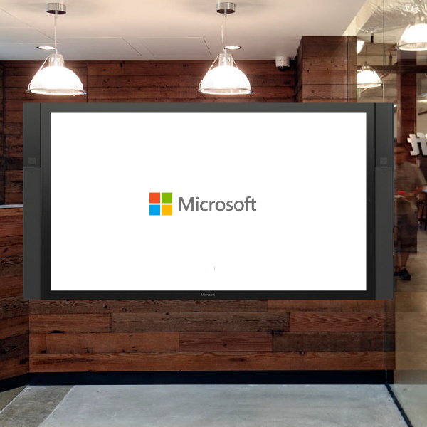
The Microsoft Recruiting team would like to have an explore Seattle app on the large display in the recruiting building lobby to create an inviting environment for job candidates, new-hires and students visiting Microsoft. The interactive touch experience engages users and creates excitement for exploring the fun attractions and activities in Seattle and on the Microsoft Campuses. The application is hands-on from scratch to a successfully launched application.TIME: 4 Weeks, July to August 2014
Research
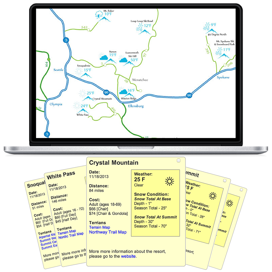
After gathering requirements and providing content including attractions categories and introductions from recruiting team, I collaborated with the developer and we envisioned an interactive Puget Sound map to be one of the two entry points to the activities. The second entry point is category view that pivots the activities by seven categories, Food, Attractions, Wineries/ Breweries, Outdoors, Market, Nightlife and Microsoft Campuses.
Use cases
- Students not familiar with Puget Sound and being highly interested in starting careers in Microsoft and expecting to explore the splendid life experience in Seattle.
- After long process on-site interview, job candidates who would like to seize the chance visiting Seattle but having no clue where to start.
- Job candidates could have networking opportunity by sighing up some sightseeing events hold by recruiting team to meet other job candidates.

Final Design
This app is heavily photo-driven. I believe photography is one of the most effective ways of conveying emotion. In Microsoft design guideline, visual system is about unique photography, dramatic color and beautiful use of type. Thus, every high-resolution attraction photo in this app was chosen and collected on my own. Regarding the visual look and feel, I used multiple bright colors as category buttons following Microsoft brand guidelines to ensure the color accessibility at the same time to bring the energy of Seattle life. Dynamic Map
The detail pop up about the specific attractions. By typing phone number, users will receive a text message about the attraction information so they are able to check it when they are on the go.

 Connection Form
Candidates can fill out a form expressing interest in meeting up with other candidates to go sightseeing.
If you have chance visiting Microsoft, please stop by Microsoft Recruiting building and play around this app to explore the fun in Seattle and Microsoft Campus!